
In this tutorial we show how to use the React-Beautiful-DnD library, what it is, how it works and what makes it work. To make the article as simple and explicit as possible, we focus on the three main pillars of this cool library:

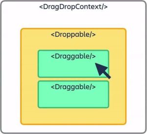
<DragDropContext /> Wraps the part of the application for which you want to have drag and drop enabled.
<Droppable /> This is the area where you can drop and contains <Draggable />.
<Draggable /> These are the elements that can be dragged.
It is valid to highlight that React-Beautiful-DnD includes a fourth pillar, which is not among the three we focus on in this tutorial:
resetServerContext() Utility for server-side rendering (SSR).
The main concept or goal of React-Beautiful-DnD is to enable a natural drag-and-drop experience as if they were physical moving objects. Those objects can have different values and can be configured according to the preferences of the content creators.
From a programming perspective, this is an abstraction of lists that can be vertical or horizontal. Elements can be dragged from one container to another.
Known to the developer community are many libraries that provide the drag-and-drop experience, including the ones we share in this link, but only two of them really pair well with React, React-DnD and React-Beautiful-DnD.
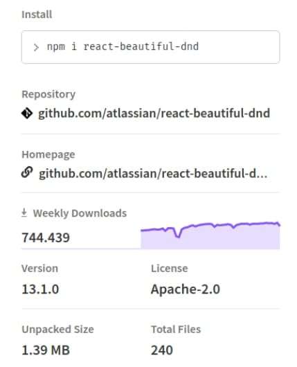
We focus on React-Beautiful-DnD, the Atlassian library that provides one of the best drag-and-drop experiences for the user, something that is confirmed by the number of weekly downloads.
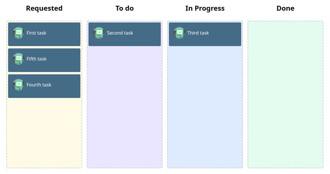
In our application, we set up some columns and tasks or elements. We start by creating the columns, each populated with random tasks. We can move the tasks to any position between the columns, or reorder the tasks in the columns.
To understand how the library and the application work, we must review and demonstrate the three main concepts mentioned at the beginning, which compose the whole concept: DragDropContext, Droppable and Draggable.
DragDropContext: as its name indicates, this is where the drag and drop action occurs. In this context we can use the main functions of the library. The function calls onDragEnd when the element or task that was being dragged is dropped. This is the only function required.
Another is onDragStart, which can be executed when an element is in the process of being dragged. There is also onBeforeCapture, which provides the functionality to interact with elements before they start being dragged.
Finally, onDragUpdate can be executed when an action is required during dragging.
These are cosmetic features that contribute to provide the desired user experience.
Droppable: the column where the task is dropped can be different or the same as the one where the action was initiated. Each task that is in the <Droppable/> will require some properties to be placed correctly.
Draggable: the task or item to be moved. Like Droppable, it requires some properties to be placed correctly.
With the concepts clearer, let’s start with the installation, which can be through Yarn or npm.
# yarn

yarn add react-beautiful-dnd

# npm

npm install react-beautiful-dnd --save

Let’s get to the code!
Once installed, we go to the App.js file, where we start building our app.
import React, { useState } from "react";
import { DragDropContext } from "react-beautiful-dnd";
import Column from "./components/Column";
import { status } from "./constants/mock";

const onDragEnd = (result, columns, setColumns) => {

};

function App() {
  const [columns, setColumns] = useState(status);

  return (
    <div style={{ display: "flex", justifyContent: "center", height: "100%" }}>
      <DragDropContext
        onDragEnd={(result) => onDragEnd(result, columns, setColumns)}
      >
        {Object.entries(columns).map(([columnId, column], index) => {
          return (
            <div
              style={{
                display: "flex",
                flexDirection: "column",
                alignItems: "center"
              }}
              key={columnId}
            >
              <h2>{column.name}</h2>
              <div style={{ margin: 8 }}>
                <Column
                  droppableId={columnId}
                  key={columnId}
                  index={index}
                  column={column}
                />
              </div>
            </div>
          );
        })}
      </DragDropContext>
    </div>
  );
}

export default App;
In the first code fragment you can see that we only import the DragDropContext, which is our wrapper and will allow us to manage the drag and drop functions of the app.
React-Beautiful-DnD
It allows only one context, but combined implementations can be made by defining a type to the Droppable, and then, from that type, we can condition the context functions.
In addition, we import a dataset to simulate a real operation, and also a Column component, that we will see next.
import React, { memo } from "react";
import PropTypes from "prop-types";
import { Droppable } from "react-beautiful-dnd";
import TaskCard from "./TaskCard";

const Column = ({ droppableId, column }) => {
  return (
    <Droppable droppableId={droppableId} key={droppableId}>
      {(provided, snapshot) => {
        return (
          <div
            {...provided.droppableProps}
            ref={provided.innerRef}
            style={{
              background: snapshot.isDraggingOver ? "lightblue" : column.color,
              padding: 4,
              width: 250,
              minHeight: 500,
              border: "2px dashed #ccc",
              borderRadius: "4px"
            }}
          >
            {column?.items?.map((item, index) => {
              return <TaskCard key={item.id} item={item} index={index} />;
            })}
            {provided.placeholder}
          </div>
        );
      }}
    </Droppable>
  );
};

Column.propTypes = {
  column: PropTypes.object,
  droppableId: PropTypes.string
};

export default memo(Column);
The most relevant of this component is the Droppable import and the use of the droppableId prop, since it is the one that will specify to React-Beautiful-DnD which will be its Droppables (columns).
Finally, we import the child component TaskCard, which we will see next, and, of course, we will pass it the necessary props.
import React, { memo } from "react";
import PropTypes from "prop-types";
import { Draggable } from "react-beautiful-dnd";
import "../styles.css";

function TaskCard({ item, index }) {
  return (
    <Draggable key={item.id} draggableId={item.id} index={index}>
      {(provided, snapshot) => {
        return (
          <div
            ref={provided.innerRef}
            {...provided.draggableProps}
            {...provided.dragHandleProps}
            style={{
              userSelect: "none",
              padding: 16,
              margin: "0 0 8px 0",
              minHeight: "50px",
              backgroundColor: snapshot.isDragging ? "#263B4A" : "#456C86",
              color: "white",
              borderRadius: "4px",
              ...provided.draggableProps.style
            }}
          >
            <div className="conten-card">
              <img
                src="https://react-beautiful-dnd.netlify.app/static/media/bmo-min.9c65ecdf.png"
                alt="logo"
                className="logo"
              />
              {item.content}
            </div>
          </div>
        );
      }}
    </Draggable>
  );
}

TaskCard.propTypes = {
  index: PropTypes.number,
  item: PropTypes.object
};

export default memo(TaskCard);
As in the previous step, there are certain relevant aspects in this component, such as Draggable, the third pillar of the library that we are using and that will allow us to drag the tasks between the different columns, as well as other props that will make it possible to populate our component.
Here we also import some styles to shape the app a little. Very important is the use of {…provided.dragHandleProps}, which will do the magic of moving the elements.
.App {
  font-family: sans-serif;
  text-align: center;
}

.logo {
  width: 40px;
  height: 40px;
  border-radius: 50%;
  margin-right: 8px;
  flex-shrink: 0;
  -webkit-box-flex: 0;
  flex-grow: 0;
}

.conten-card {
  display: flex;
  align-items: center;
  justify-content: flex-start;
}
Finally, we modify the onDragEnd function to update the order of the elements in each column to complete our example app.
const onDragEnd = (result, columns, setColumns) => {
  if (!result.destination) return;
  const { source, destination } = result;

  if (source.droppableId !== destination.droppableId) {
    const sourceColumn = columns[source.droppableId];
    const destColumn = columns[destination.droppableId];
    const sourceItems = [...sourceColumn.items];
    const destItems = [...destColumn.items];
    const [removed] = sourceItems.splice(source.index, 1);
    destItems.splice(destination.index, 0, removed);
    setColumns({
      ...columns,
      [source.droppableId]: {
        ...sourceColumn,
        items: sourceItems
      },
      [destination.droppableId]: {
        ...destColumn,
        items: destItems
      }
    });
  } else {
    const column = columns[source.droppableId];
    const copiedItems = [...column.items];
    const [removed] = copiedItems.splice(source.index, 1);
    copiedItems.splice(destination.index, 0, removed);
    setColumns({
      ...columns,
      [source.droppableId]: {
        ...column,
        items: copiedItems
      }
    });
  }
};
The end result is a functional application that will allow moving and reallocating multiple columns and, at the same time, multiple items in those columns.
The natural sense of movement for the user comes from a number of features, such as dynamic space allocation for items and drag-and-drop functionality.
There are many possible uses for such an application, from creating organizational charts to creating to-do lists and staff assignments, among others.
Conclusions
React-Beautiful-DnD is very versatile, for what it offers. In comparison, React-DnD is even more versatile, providing a higher-level abstraction that can be used for a variety of lists and movements between lists.
These notes can be taken into account when defining which of these libraries would be more suitable for your application, as both have strengths. If a more robust approach is required, React-DnD may be the right one.
We hope this small contribution will be useful in your project.
We share with you the complete code we developed during this small tutorial:
Resource
https://codesandbox.io/s/tutorial-multiple-rbd-i2wm6
Official Documentation
https://github.com/atlassian/react-beautiful-dnd
React-Beautiful-DnD Story Book
https://react-beautiful-dnd.netlify.app/