
Requirements
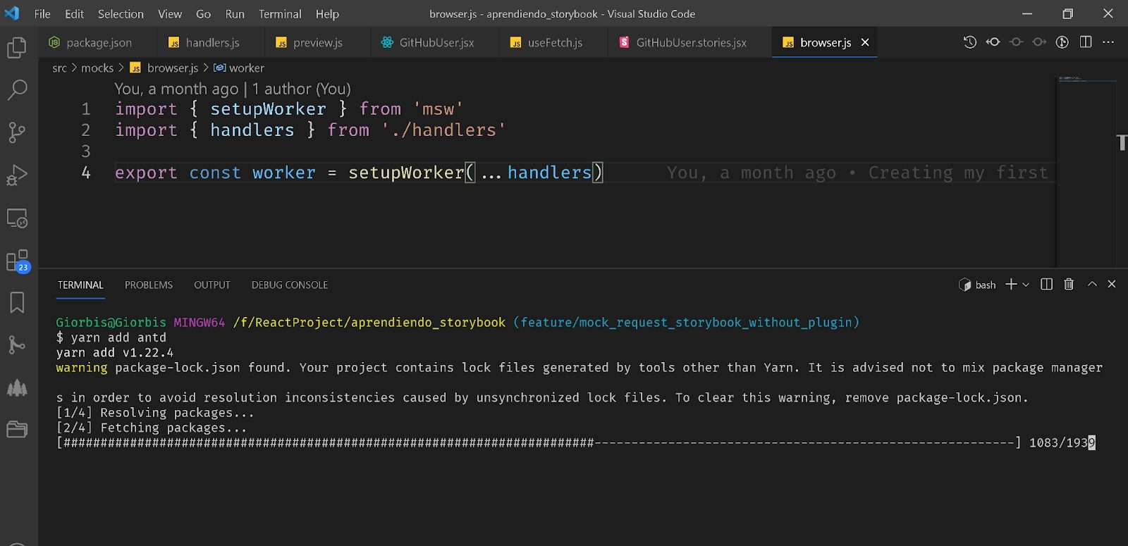
In the second part we learned how to mock the requests that our components make to the server, while in the first part, how to create a project with the necessary configuration to work with Storybook, and thus be able to test our components. Today we continue evaluating some other interesting aspects of this tool.
Introduction
In many projects we use component libraries. In React there are many of them, and although they already have very well defined their features and operation, it is good to test how they will integrate with the components that we will create and will be part of our application, with their own particularities. Therefore, it is a good idea to configure Antd with Storybook. In this article we will be reviewing the necessary steps for Antd to be integrated with Storybook.
Code of the Application
https://github.com/giorbismiguel/aprendiendo_storybook
What is Ant Design?
Ant Design is a library of components for ReactJs that we can use in our projects. It allows us to create more complex interfaces using the structures they have and taking advantage of the interactivity they offer, in addition, we save time because its components are highly configurable and avoids, for the most part, having to make adaptations of them.
Installation and configuration of Ant Design with Storybook
To configure Ant Design with Storybook the first thing we have to do is to install the library within a project that has React and Storybook configured. From this configuration we open the project with our favorite editor and in the root of the project, we execute the following command to install Ant Design.
yarn add antd
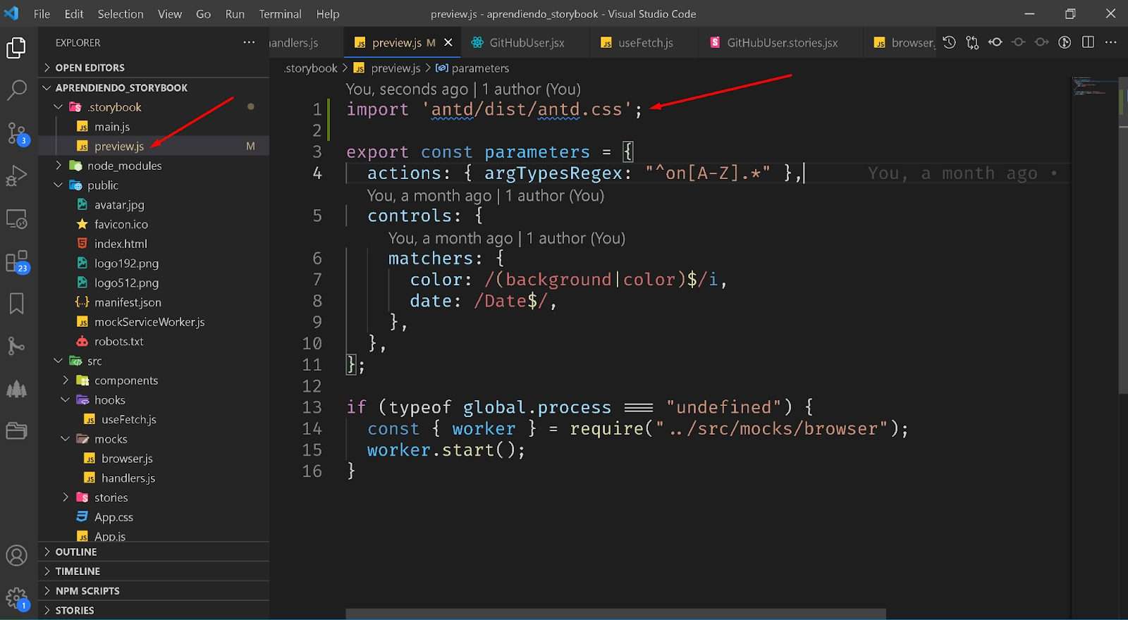
When the installation is finished we have to tell Storybook to use Antd’s CSS style sheets, for which we go to the .storybook folder inside the project and look for the preview.js file and add at the beginning the line: import ‘antd/dist/antd.css’;
Then we go to the components folder and add 2 files: AntdCard.jsx and AntdCard.stories.jsx. This way we are going to test that when importing an Antd Design component it loads correctly inside Storybook. This means that the components are displayed correctly, and with the css styles that Ant Design has predefined.
To test, we are going to use the Card component from Ant Design and specifically the variant: https://ant.design/components/card/#components-card-demo-simple. Here is an example to copy inside the file: AntdCard.jsx.
import React from "react";
import { Card } from "antd";
const { Meta } = Card;

export const AntdCard = () => {
  return (
    <Card
      hoverable
      style={{ width: 240 }}
      cover={
        <img
          alt="example"
          src="https://os.alipayobjects.com/rmsportal/QBnOOoLaAfKPirc.png"
        />
      }
    >
      <Meta title="Europe Street beat" description="www.instagram.com" />
    </Card>
  );
};
Now let’s create the story for that component by opening the file AntdCard.stories.jsx and update it with the following code:
import React from 'react'

import { AntdCard } from './AntdCard';


export default {

  title: "AntD Card",

  component: AntdCard,

};


export const DefaultState = () => <AntdCard />;
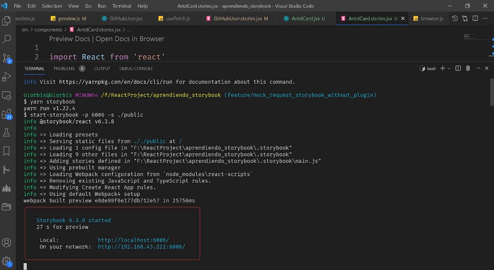
With this we can now test the command to display the Storybook and check if the Card component loaded correctly, just like the examples on the And Desing site. To do this we execute the command:
yarn storybook
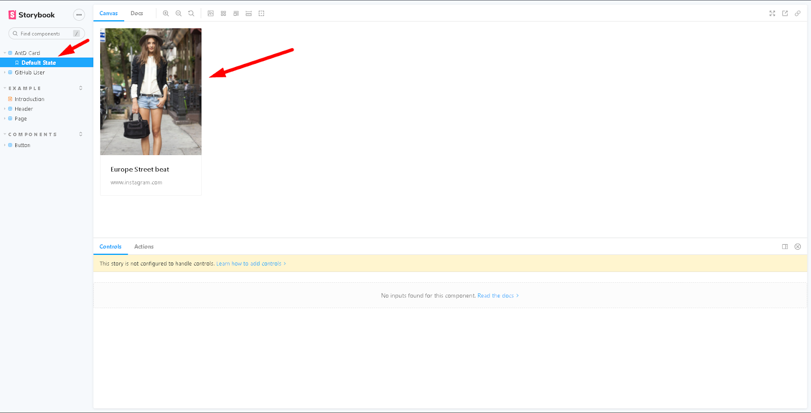
You must load the Storybook page in the Local url, check that the Ant Design Card component is correctly displayed, just as you can see in the following image:
Conclusions
By integrating Antd with Storybook, within a project, all the components of the application can be seen as the client will. The Antd library, on the other hand, makes it possible to create forms, tables and other more complex structures in the application, all of which can be seen and tested within Storybook, with CSS styles and classes. With this important tool the libraries are more useful. It is an excellent combination that we recommend.
Bibliography